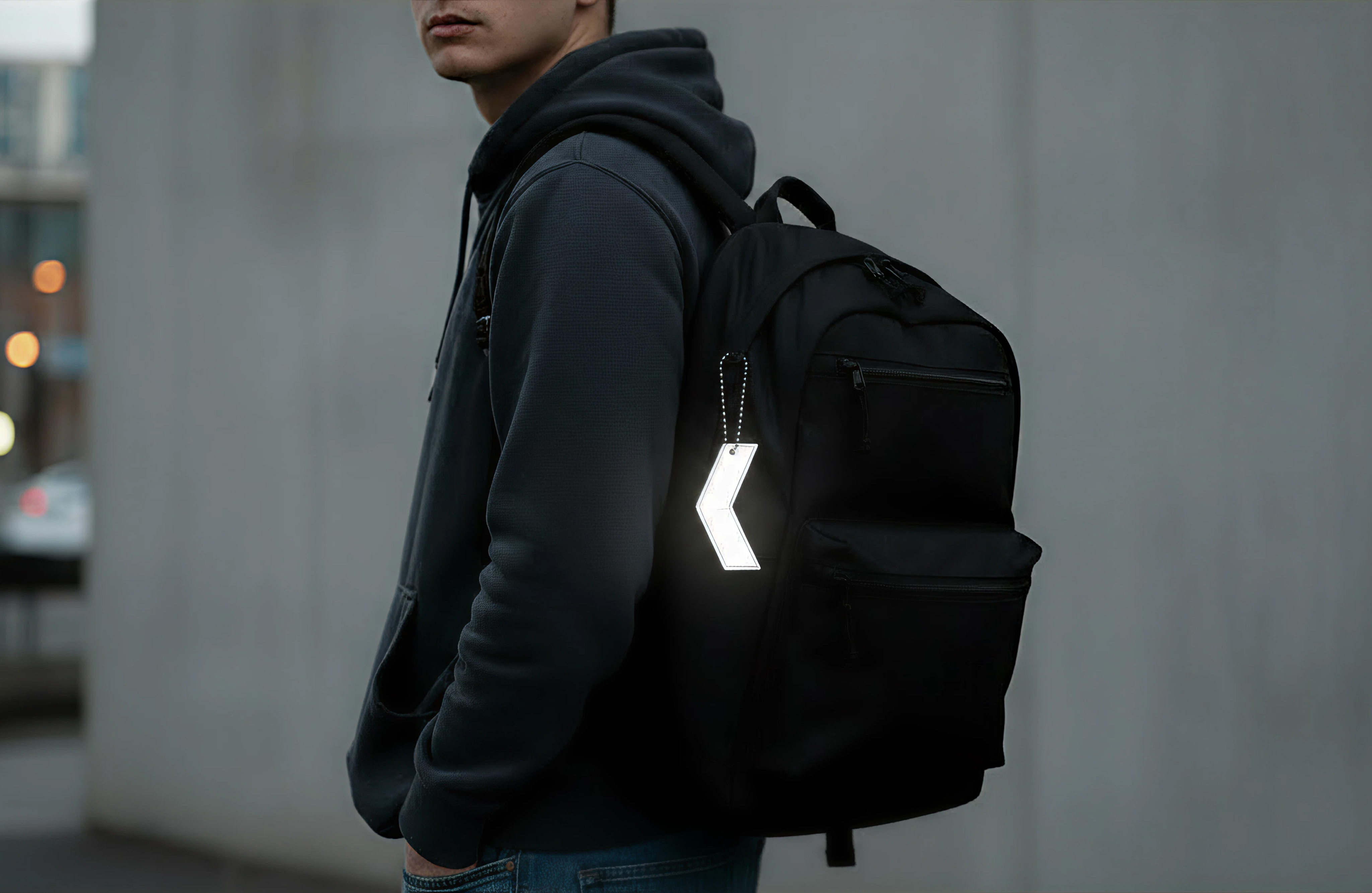
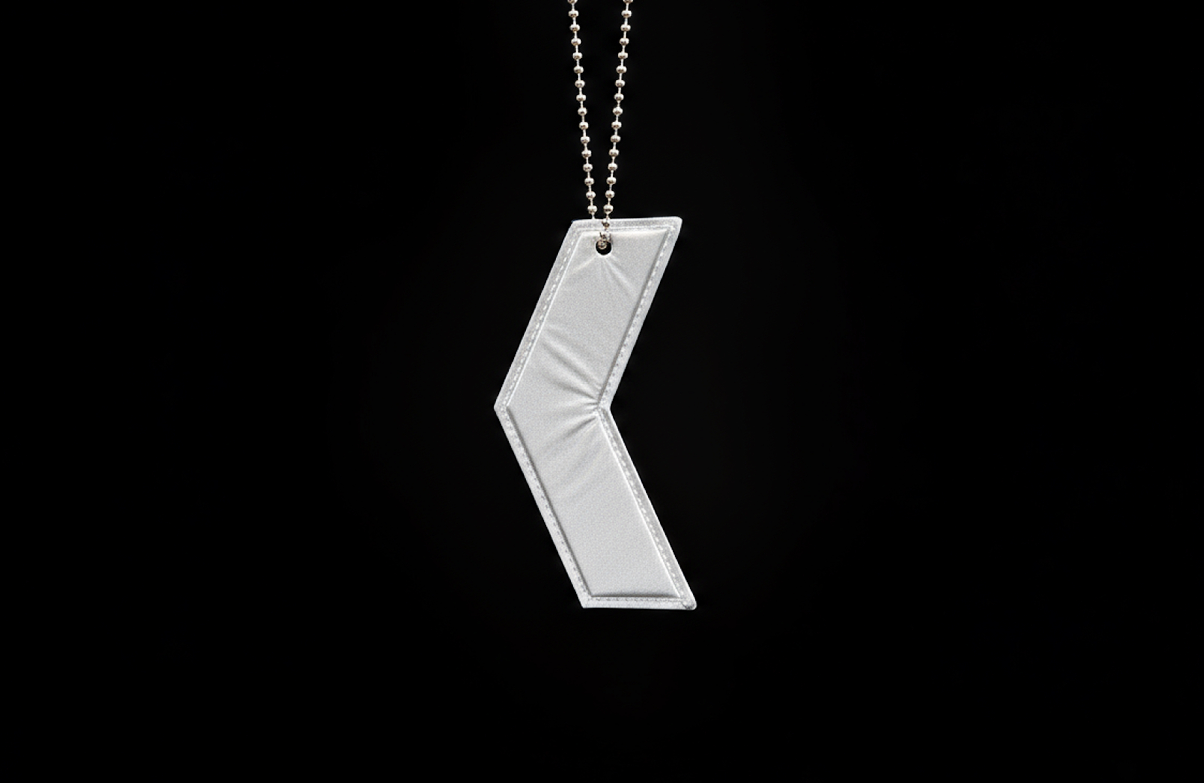
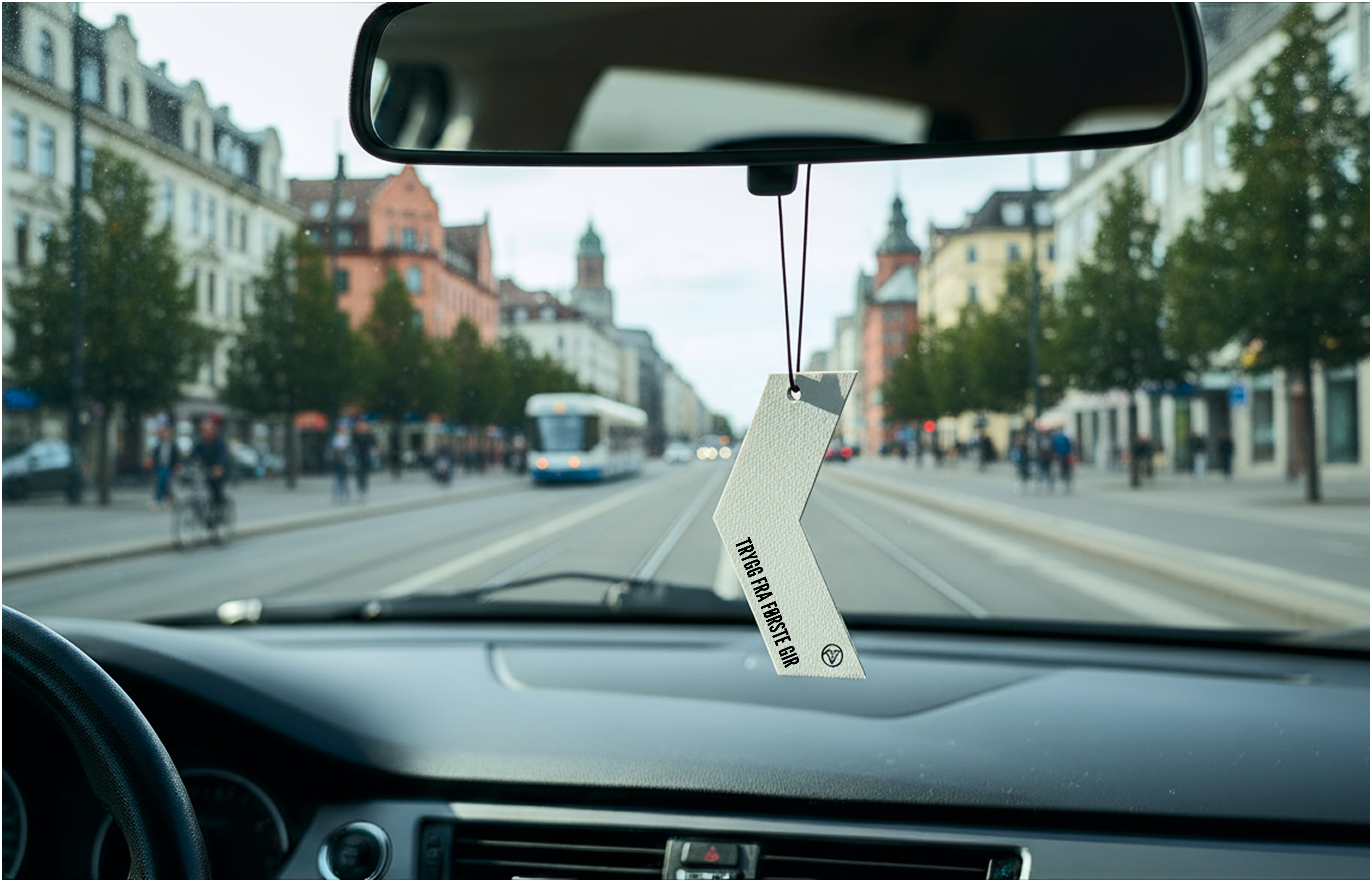
From traffic training to traffic scent
Another idea, as a more playful extension, a series of air fresheners in the same design language. Different scents and slogans: Vanilla – “Safe from first gear” / Lavender – “Clutch Queen”.
The designs builds on the identity, but with a twinkle in the eye, and a scent that makes the brand stick, literally.
“Good design doesn't stop at the driver's license. It continues in the rearview mirror, on your backpack and maybe around the next corner.”
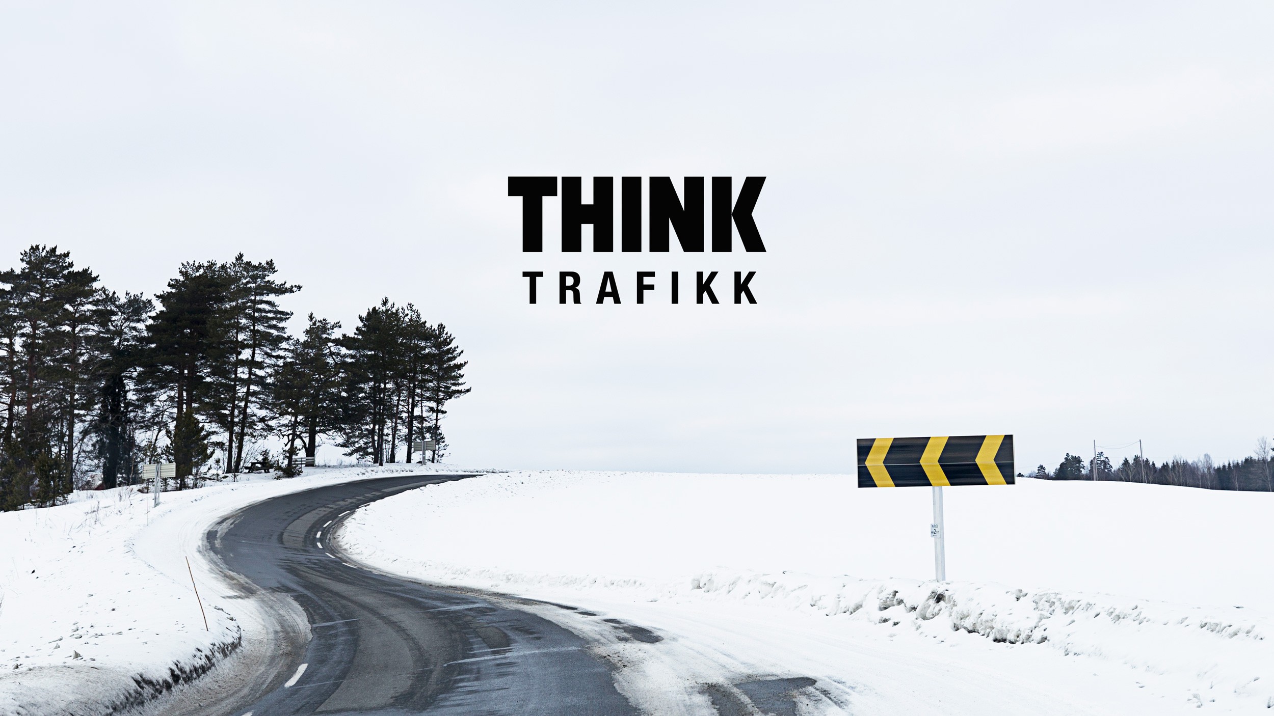
Project overview
Client
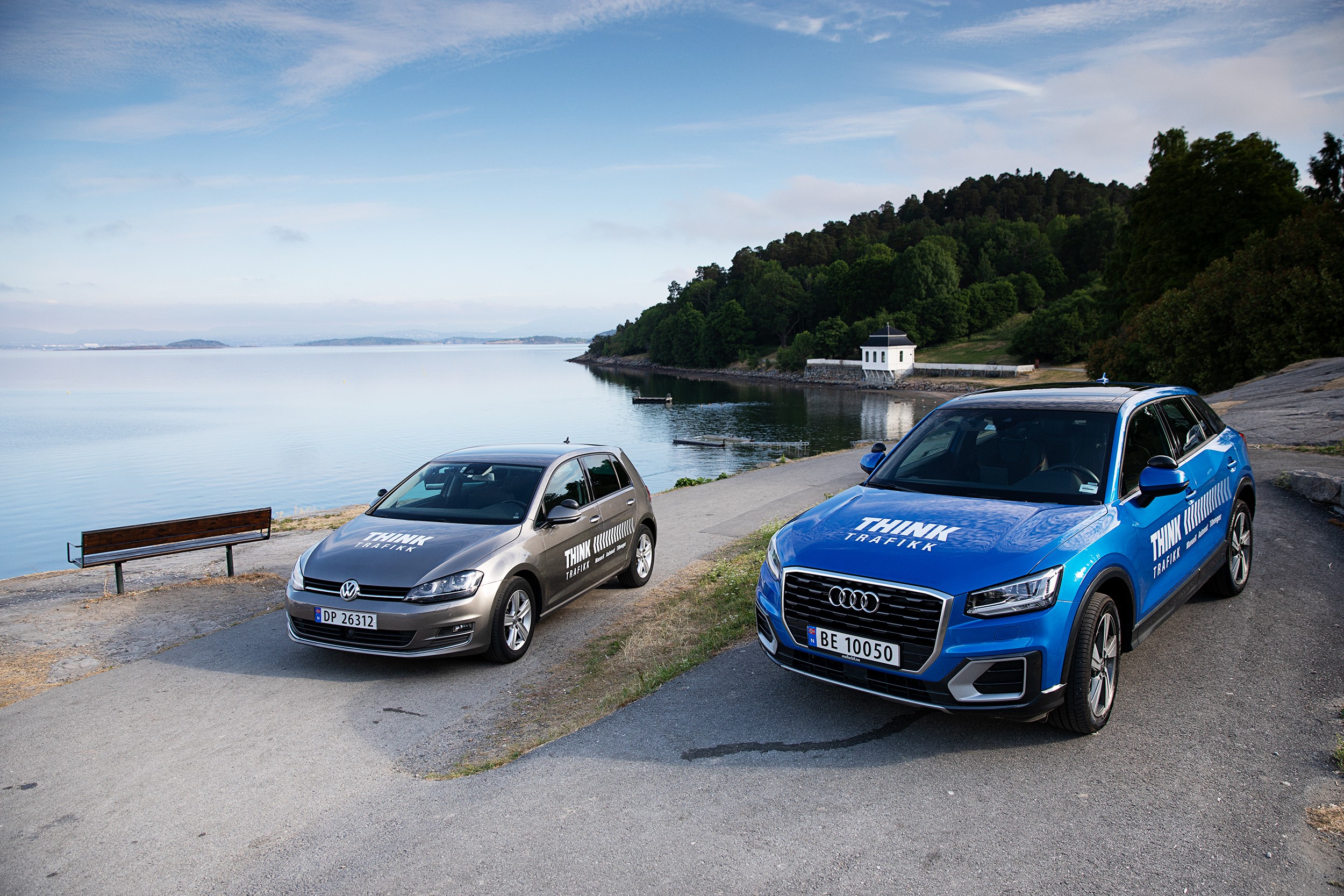
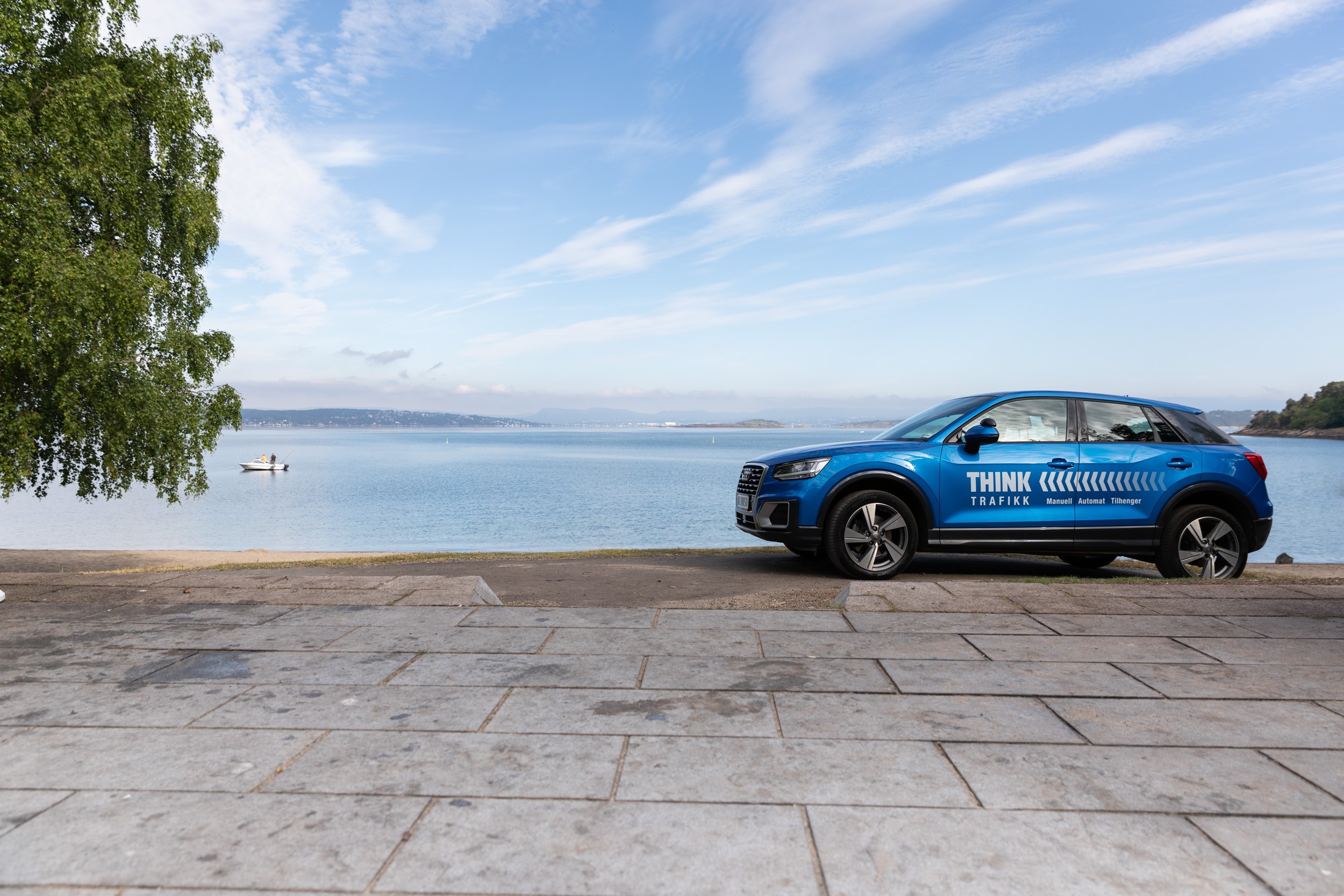
Think Trafikk
Role
Graphic designer, Photographer
Type
Logo design, Car decoration, Merch
Prosess
Ideas, Sketches, Design, Finalizing, Mockups
Tools
Adobe (llustrator, Photoshop, Indesign)
Year
2018/2025